The Problem
They offered 24/7 emergency plumbing — but their old website didn’t feel urgent, trustworthy, or premium.
Weak visuals. Cluttered layouts. No real call-to-action strategy.
People searching for emergency plumbing services don’t want to “explore.”
They want confidence fast — and the old site wasn’t delivering it.
The Treatment
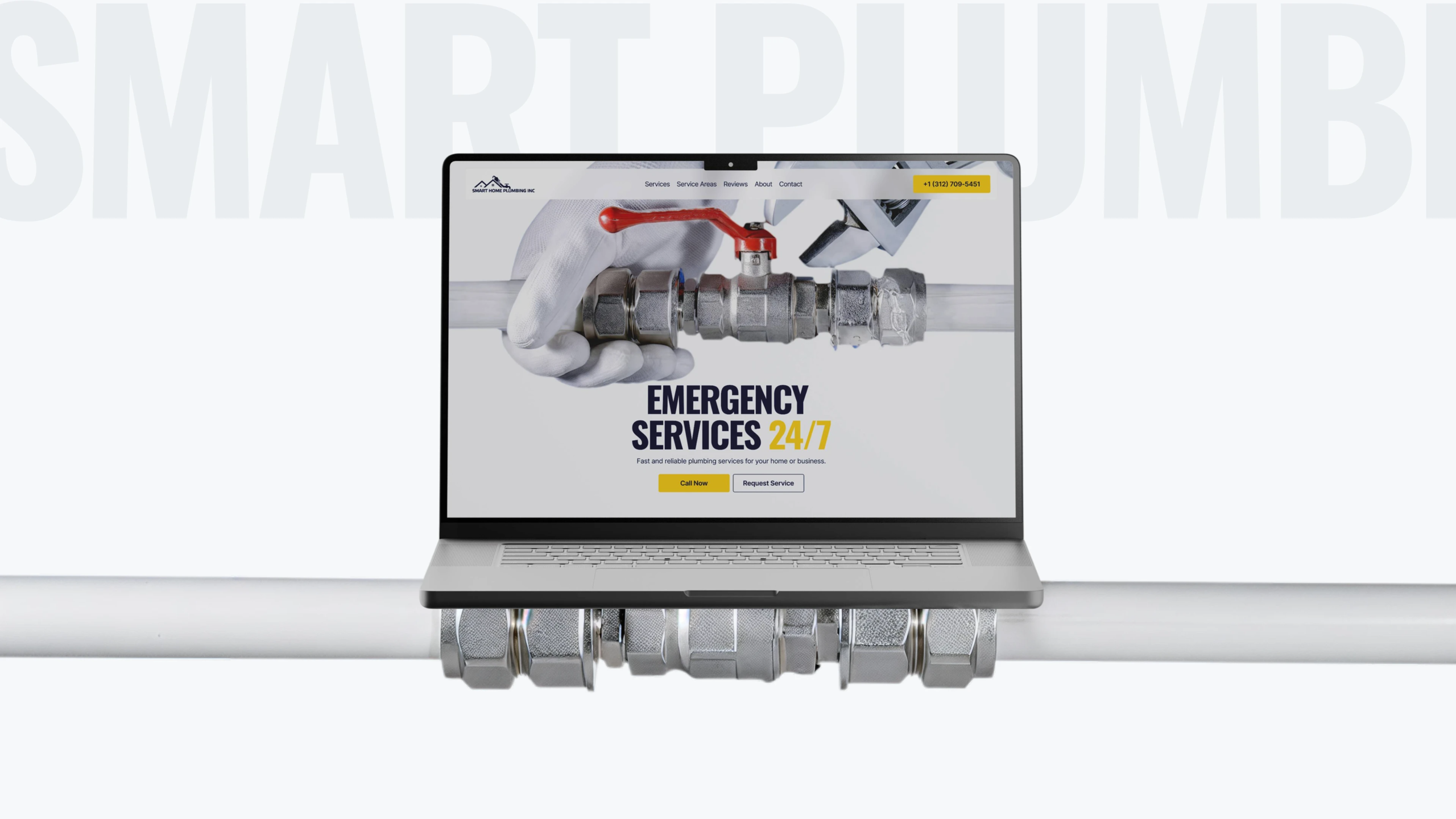
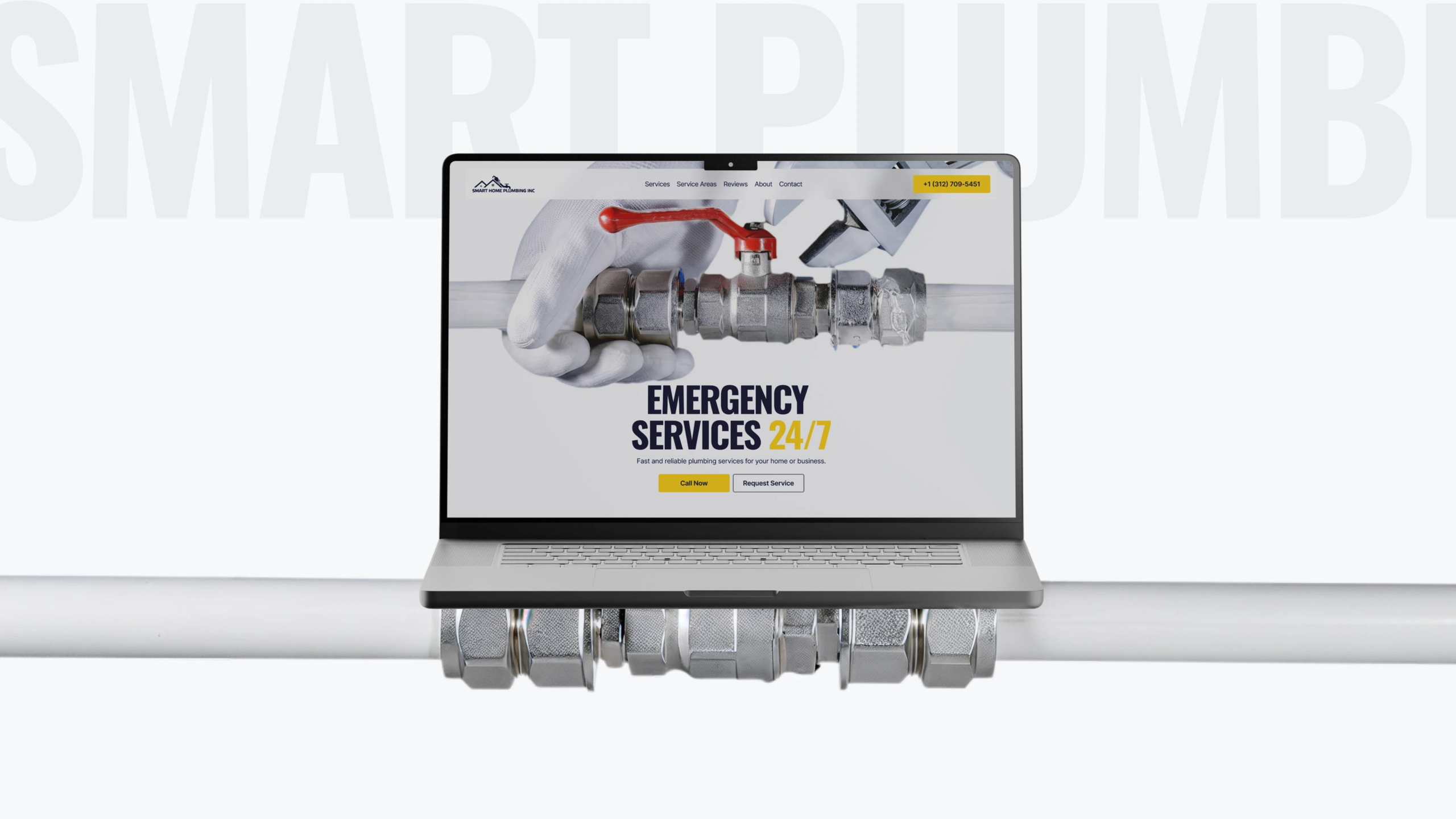
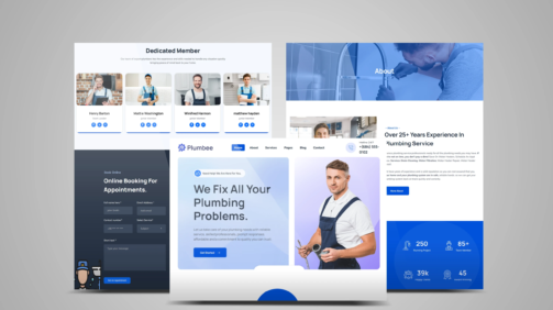
We designed a high-conversion plumbing website that feels fast, reliable, and built for real emergencies.
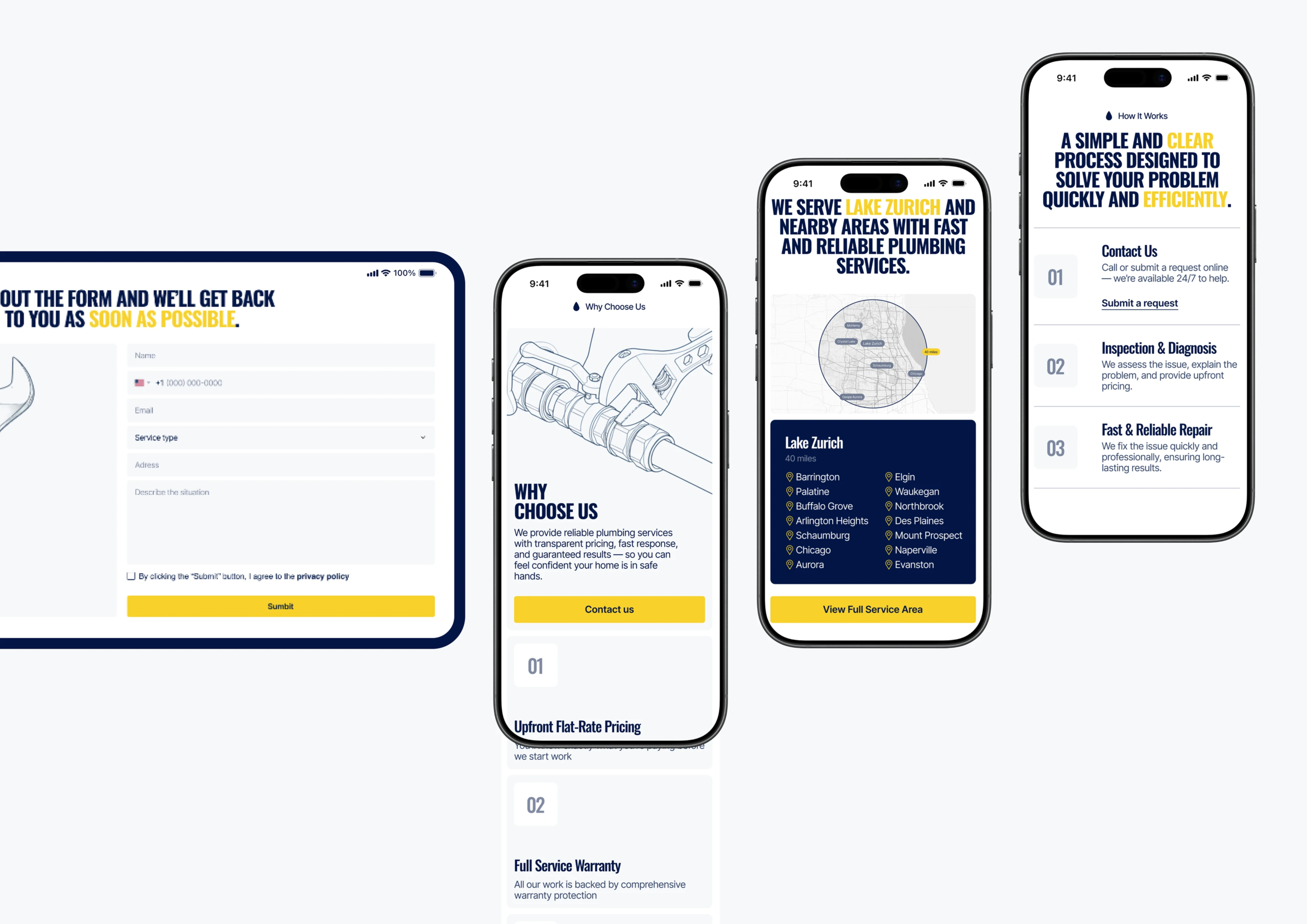
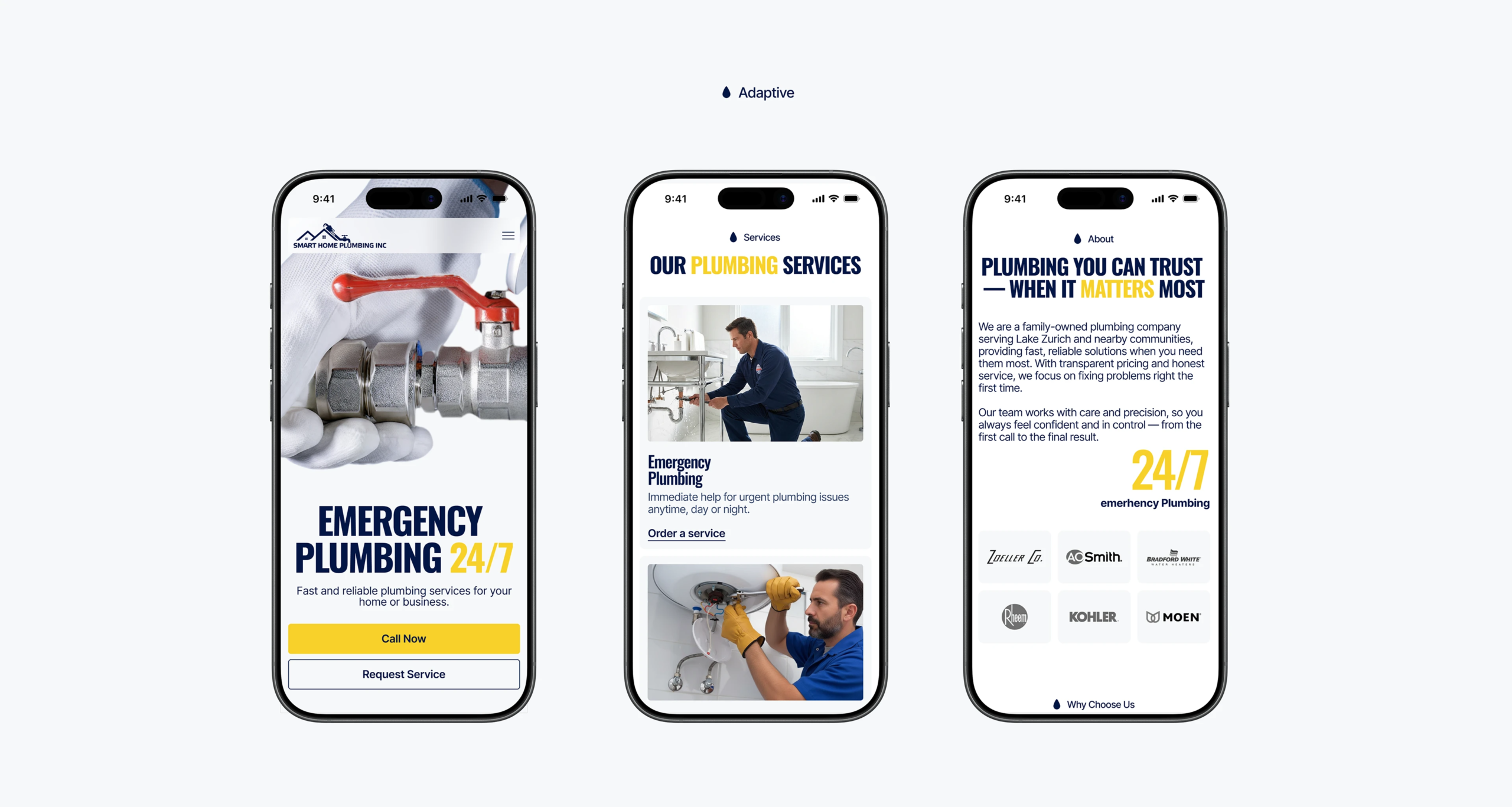
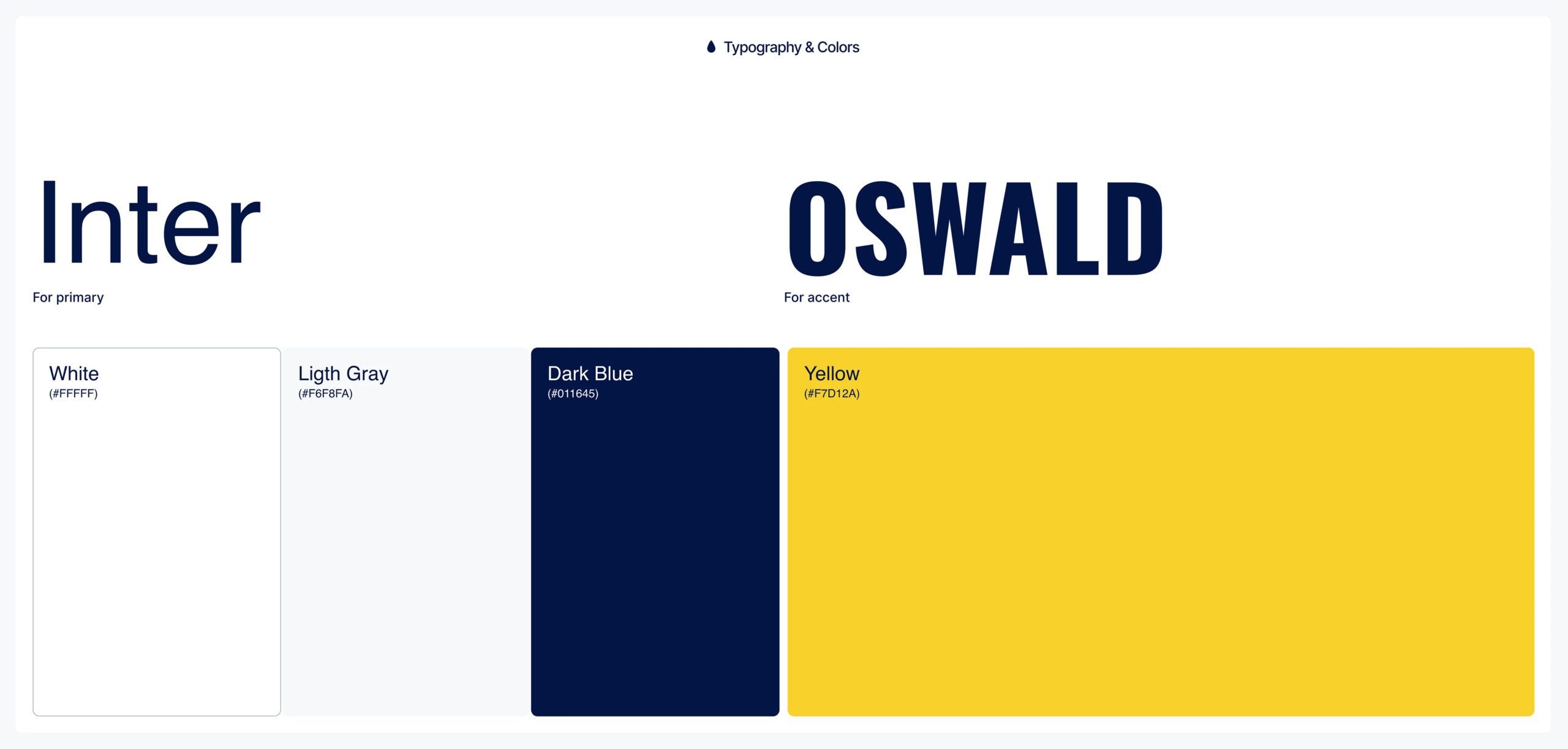
Design: Clean industrial-inspired UI with bold typography, strong contrast, and a layout that instantly communicates trust and urgency
Content: Direct, no-fluff messaging focused on speed, reliability, and customer reassurance — because nobody reads essays during a plumbing disaster
Functionality: Sticky call buttons, streamlined service requests, mobile-first optimization, and strategically placed CTAs that drive instant action
Visuals: Custom hero sections, polished service imagery, modern mockups, and subtle animations that make the brand feel established and professional
The Results
+310% increase in emergency service inquiries
Mobile call clicks nearly doubled within weeks of launch
Faster load speeds led to longer session times and lower bounce rates
The client said customers now “trust us before they even pick up the phone” — exactly the outcome we built for.