The Problem
The beverage market is saturated with brands that all look and sound the same — overly generic packaging, forgettable visuals, and little emotional connection with consumers.
Sans Spirit needed a strong identity that could instantly stand out on shelves while communicating freshness, flavour, and a modern alcohol-free lifestyle.
The challenge was to create a beverage brand that felt playful, premium, refreshing, and highly recognizable across packaging, social media, advertising, and retail environments.
The brand also needed a scalable visual system capable of supporting multiple flavours while maintaining a cohesive and memorable identity.
The Treatment
We created a bold and energetic beverage identity centered around simplicity, flavour-driven visuals, and modern lifestyle branding.
Custom Brand Identity: A distinctive typographic logo was designed with bold serif letterforms to create a memorable, friendly, and premium personality that feels modern yet timeless.
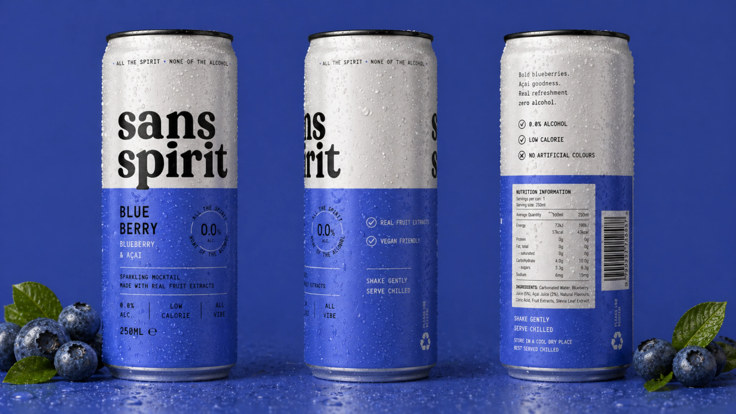
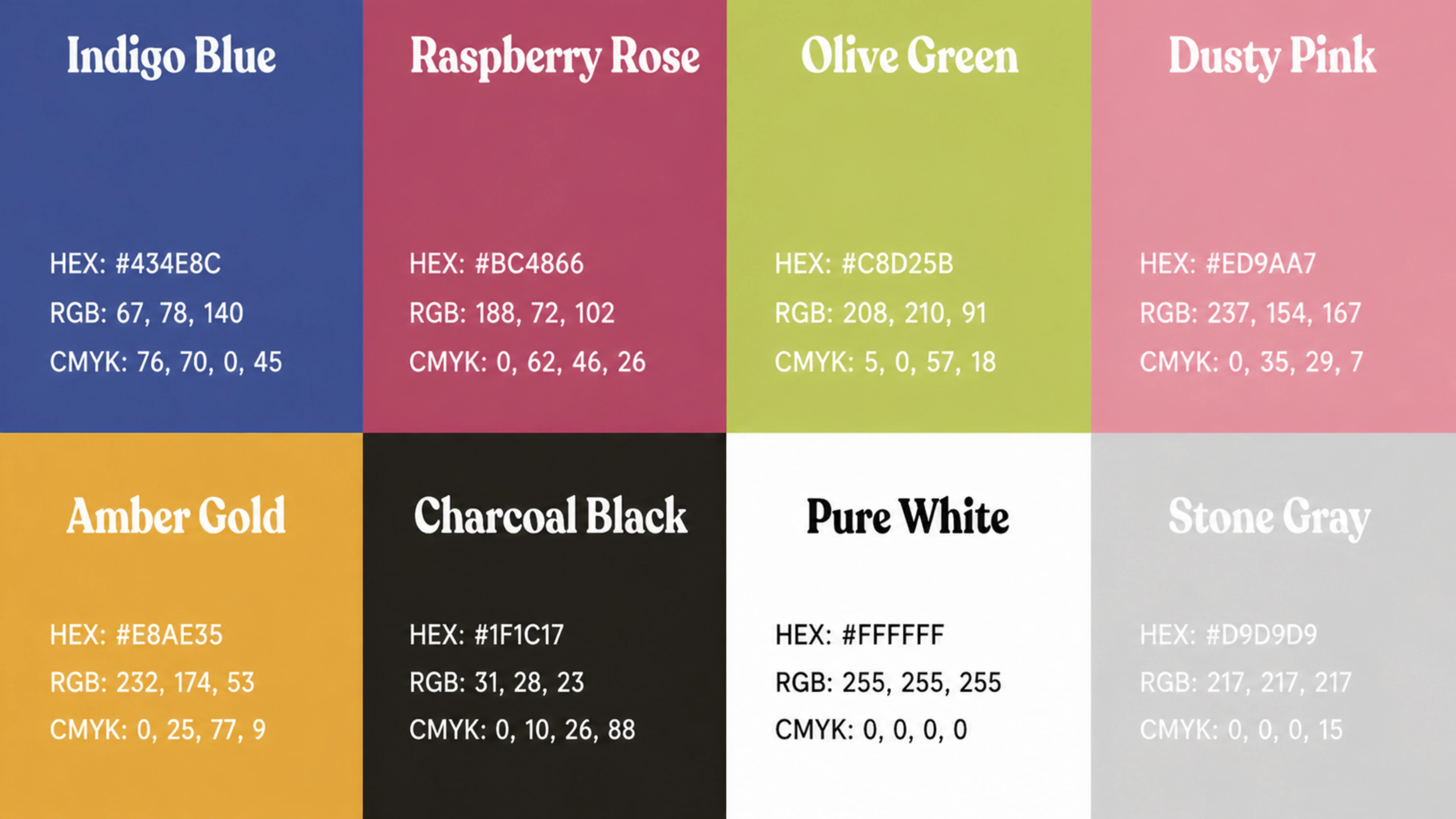
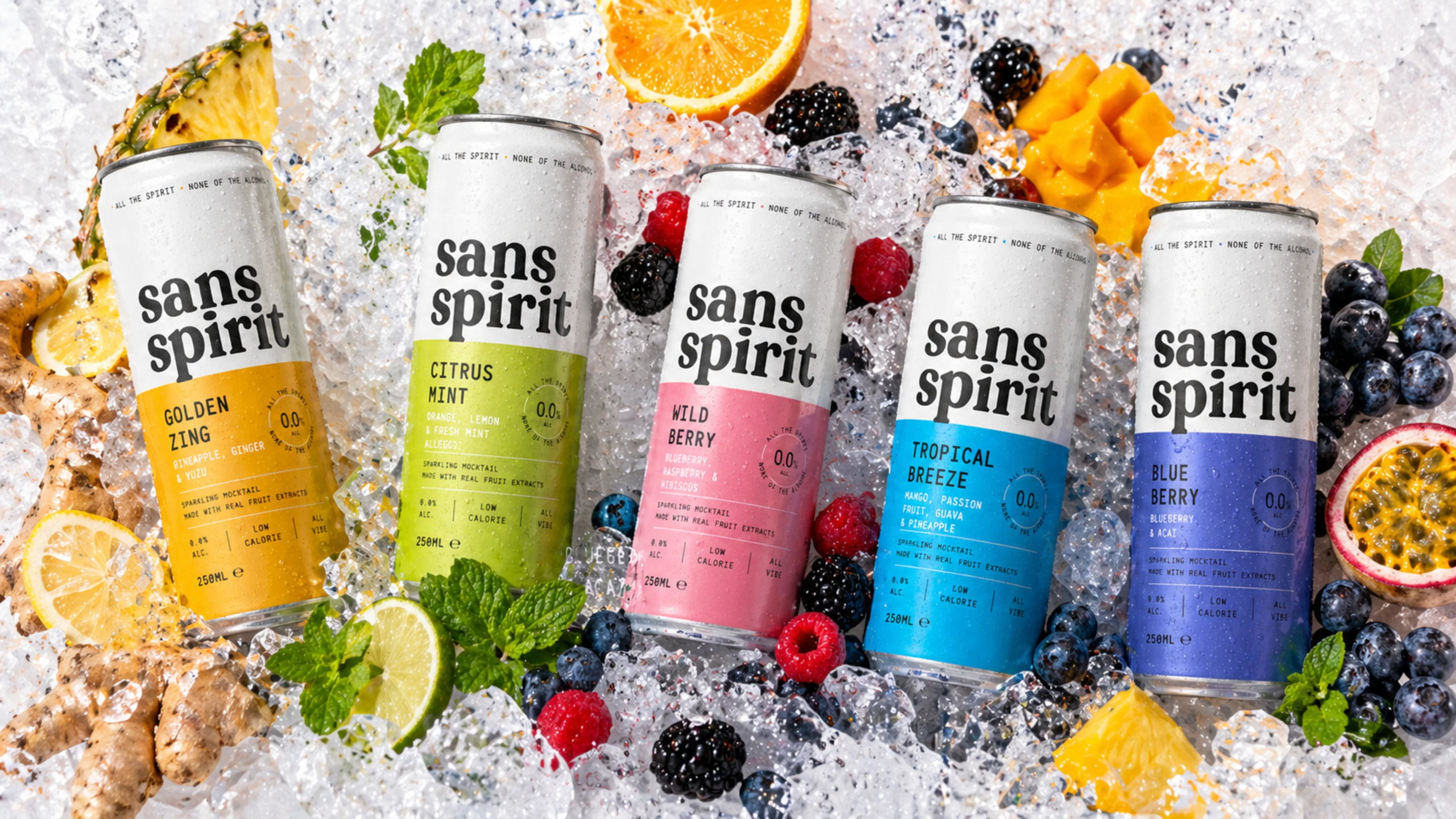
Vibrant Packaging System: Each flavour received its own striking colour palette, allowing the products to stand out individually while still feeling unified as a product family.
Modern Can Design: Clean layouts, strong typography, and minimal visual clutter were used to create packaging that feels refreshing, premium, and highly shelf-visible.
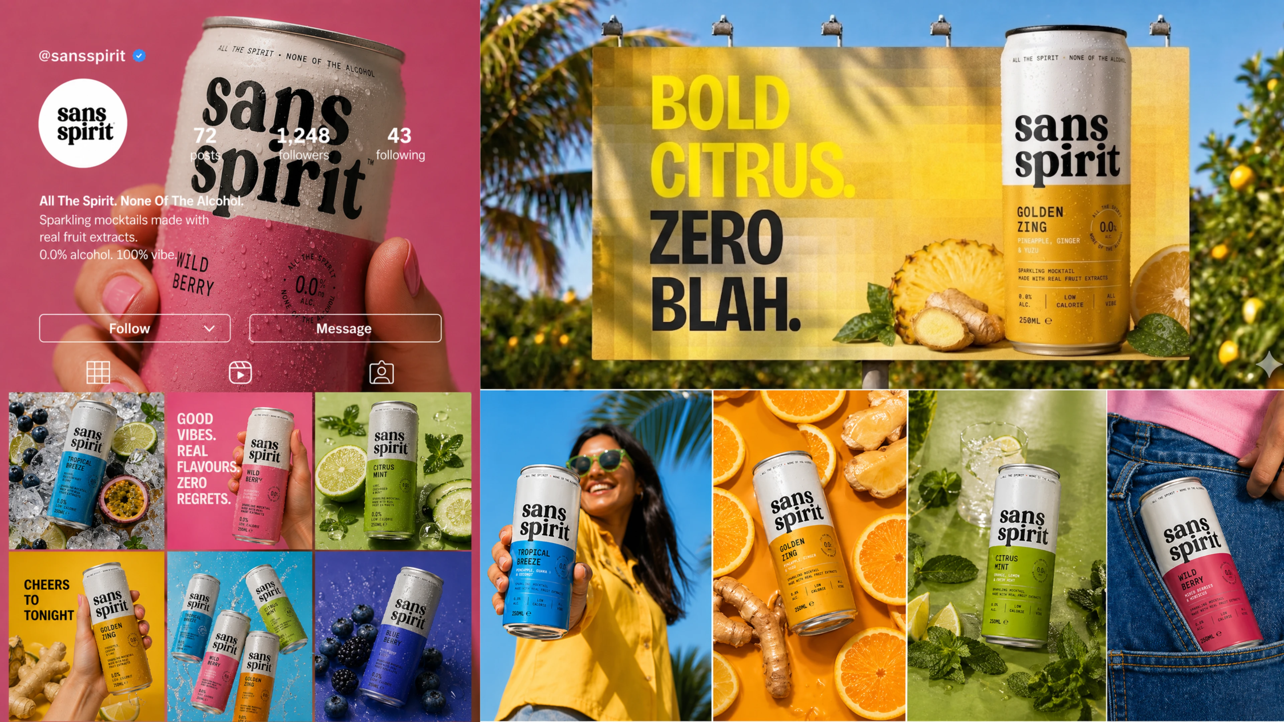
Flavor-Focused Visual Direction: Fruit imagery, vibrant tones, and energetic compositions were incorporated throughout the branding to emphasize freshness and taste.
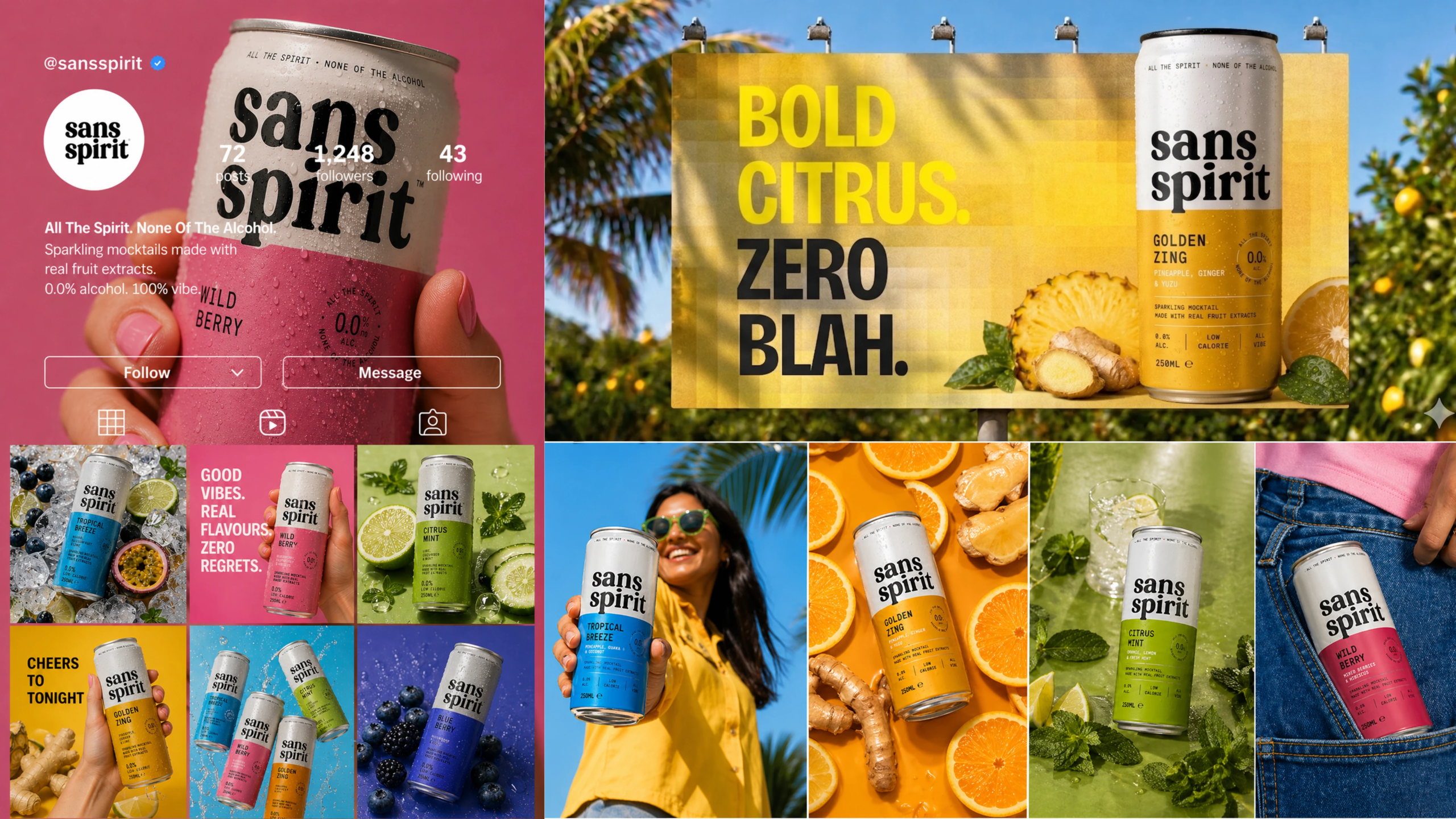
Social Media Branding: A cohesive social media system was developed using lifestyle photography, bold campaign graphics, and playful messaging to build a strong online presence.
Marketing & Advertising Assets: Billboard concepts, promotional graphics, and campaign visuals were designed to maintain consistency across digital and physical advertising channels.
Scalable Product Architecture: The branding system was carefully structured to support future flavour expansions without losing brand recognition.
Premium Yet Playful Experience: The balance between minimalist typography and colourful visuals helped position the brand as modern, approachable, and lifestyle-focused.
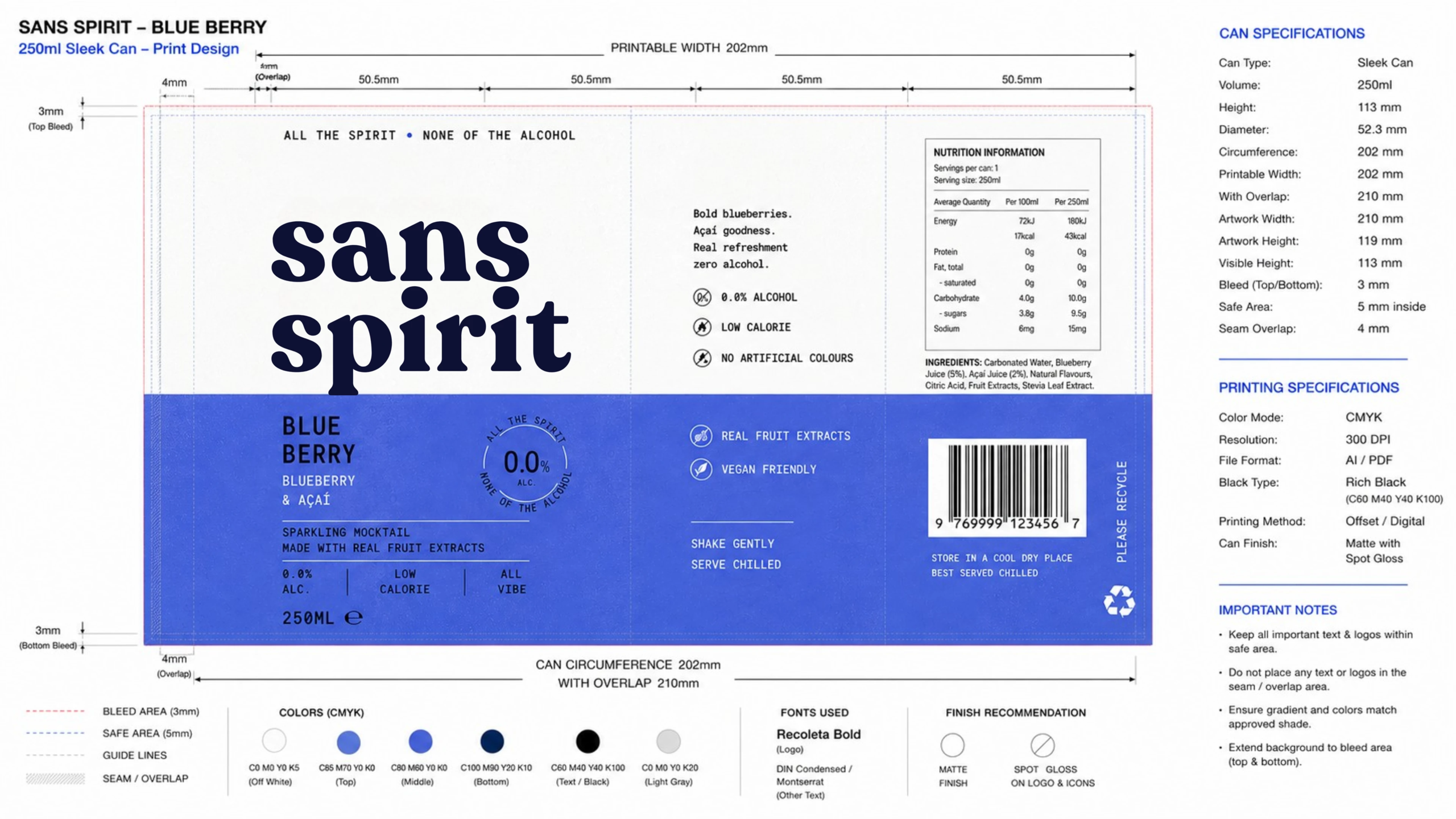
Production-Ready Packaging: Detailed print-ready can specifications, color systems, and packaging guidelines were developed to ensure accurate manufacturing and brand consistency.
The Results
A bold and instantly recognizable beverage identity that stands out in a competitive market
Improved shelf appeal through vibrant flavour-based packaging and strong typography
A cohesive visual system across cans, social media, advertising, and promotional assets
Stronger audience engagement through energetic lifestyle-focused branding
A scalable packaging architecture ready for future product and flavour expansion
Enhanced premium perception while maintaining a fun and approachable personality
A visually memorable brand experience that captures freshness, flavour, and modern alcohol-free culture.